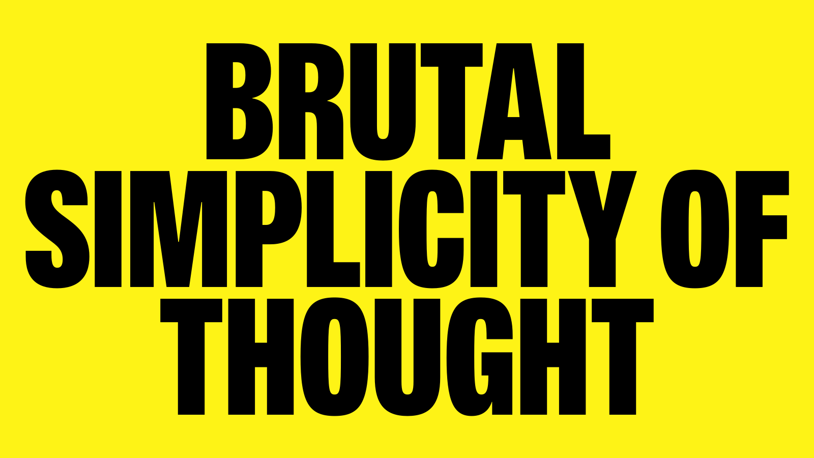
M+C Saatchi is the world’s largest independent creative network, applying a brutal simplicity of thought to shape conversations, brands, and movements for the last 30 years.
I worked with Re, a design agency within the M+C Saatchi group, to re-draw and extend the existing brand typeface as part of a identity update.
The uppercase-only Heavy has been a fundamental element of the M+C Saatchi identity for decades. It had been in use for so long that its quirks had become almost invisible.
However, those quirks were at-odds with the core ethos of ‘Brutal Simplicity’, which calls for a brand typeface that is clean and neutral enough to allow the messaging to do the talking.
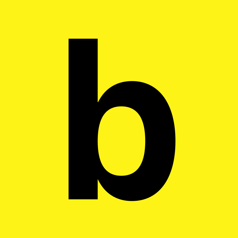
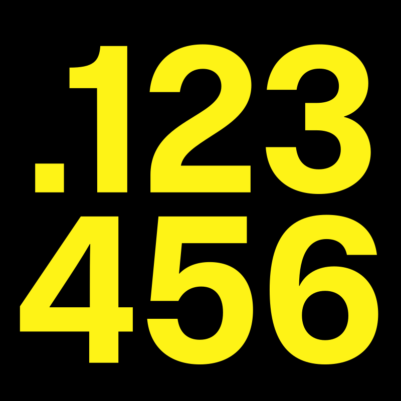
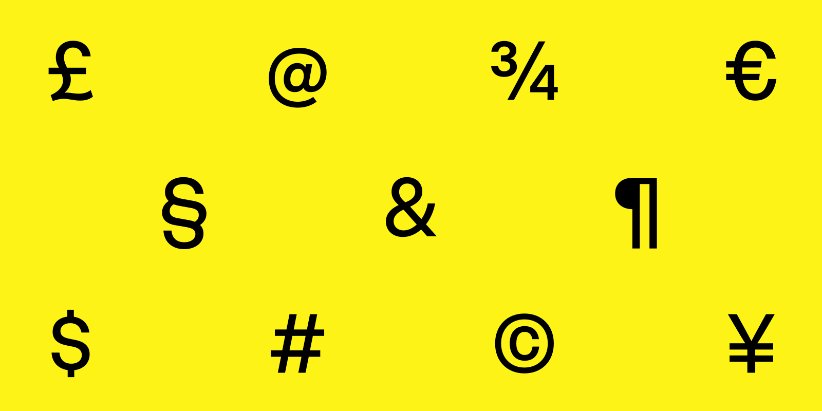
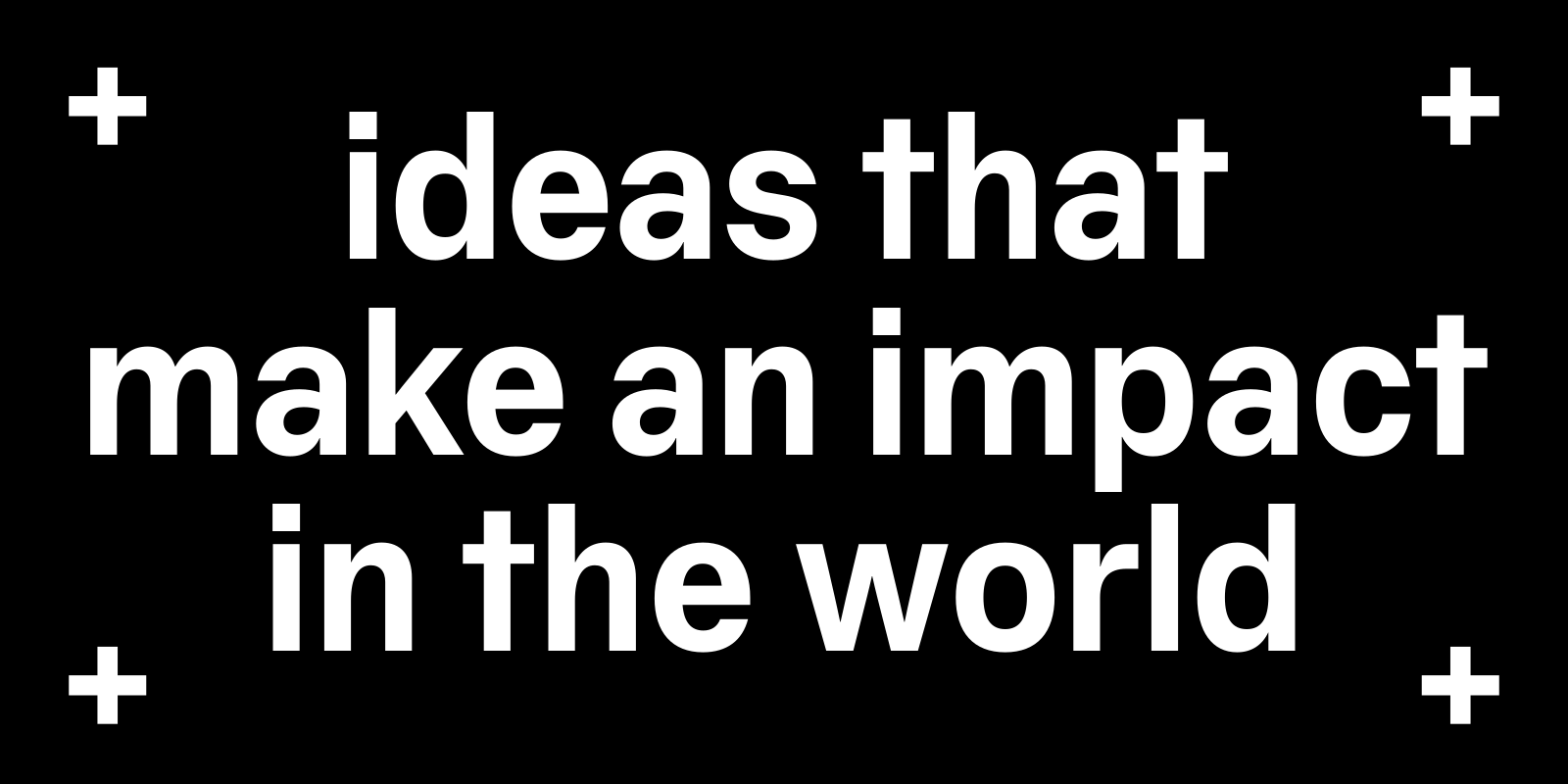
The Heavy style was re-drawn, distilling it down into its most essential construction. Proportions and weight distributions were corrected; wood-type-esque details were eliminated.
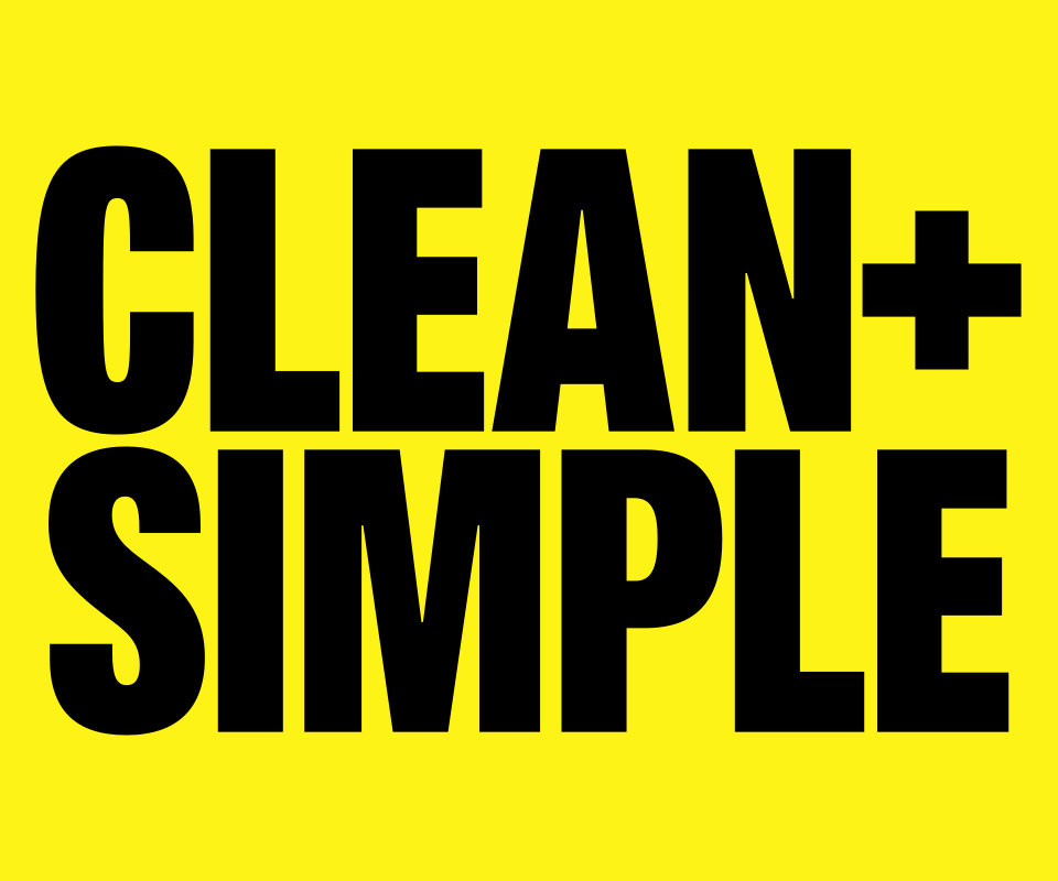
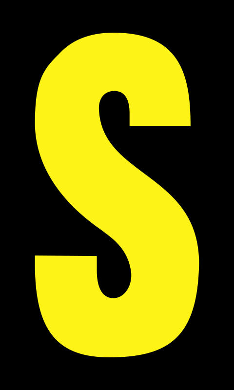
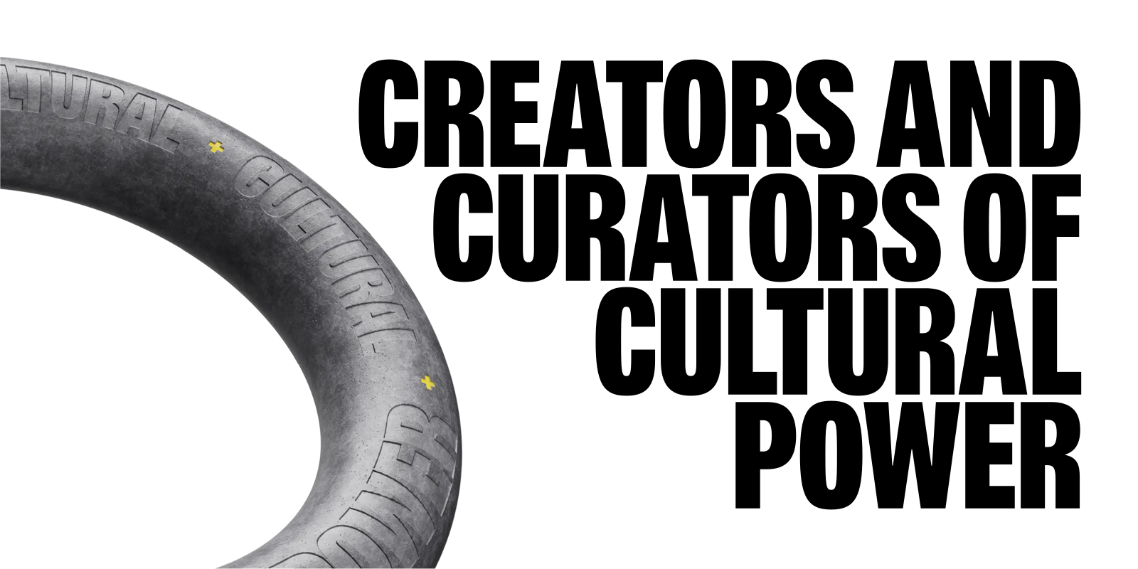
In order to support the Heavy style, I designed an all-new Regular and Bold, creating a unified typographic system that can deliver M+C Saatchi’s punchy messaging at every scale.